1912 Historic Craftsman Kitchen Remodel
When we first looked at this home, we knew it had a lot of potential. Being built in 1912 and historically designated, it had good bones. The kitchen however was screaming for a makeover.
Sometime in the 70’s the kitchen had been remodeled with white and brown boxy particle board upper cabinets that failed to run the length of the galley kitchen or reach the ceiling (prob short 3 feet or so). The kitchen has 9 foot ceilings, so this coupled with short boxy cabinetry resulted in a lot of unused space through out the entire kitchen. Brown countertops and lower cabinetry also did not run the length of the kitchen.
So we had, brown and white cabinetry, brown countertops, brown and white tile, and tan walls. Inviting right?
Did I mention that the oven was at the back of the galley kitchen up against to walls? When you opened the oven your butt would bonk into the cabinet behind you. Really safe to have 33 inches between galley countertops right? A bare minimum requirement today is 36 inches (3 feet) between counters. Four to five feet of space is optimal.
View of the kitchen during our home inspection. It did not help that the seller was not super clean.
We knew there was no way to expand the kitchen. The kitchen runs parallel with a hall way and backs up against a bathroom and dining room. There was no give. Expansion was not an option, but we knew we could redesign the footprint and make the space functional.
The fortunate thing about our galley kitchen, is that we actually have an entrance from the hallway that like I mentioned above runs parallel with the kitchen. We also knew we could open up the single entrance that leads from our formal dinning room into the kitchen.
Blowing open the wall, and reframing the entrance from the dining room created a direct view of the kitchen from other angles of the home. Visually we doubled the walkthrough. We matched the framing to framing found throughout the home to keep the look consistent.
Tasks:
Open doorframe from Dinning room
Relocate oven, fridge, dishwasher, trash, pantry and wine fridge
Select counter, backsplash, cabinetry, grout, appliances, paint, accessories/trim pieces
Install canned lighting
Paint kitchen and dinning room
“Living through a home renovation is like living in the wild... You do whatever it takes to survive.”
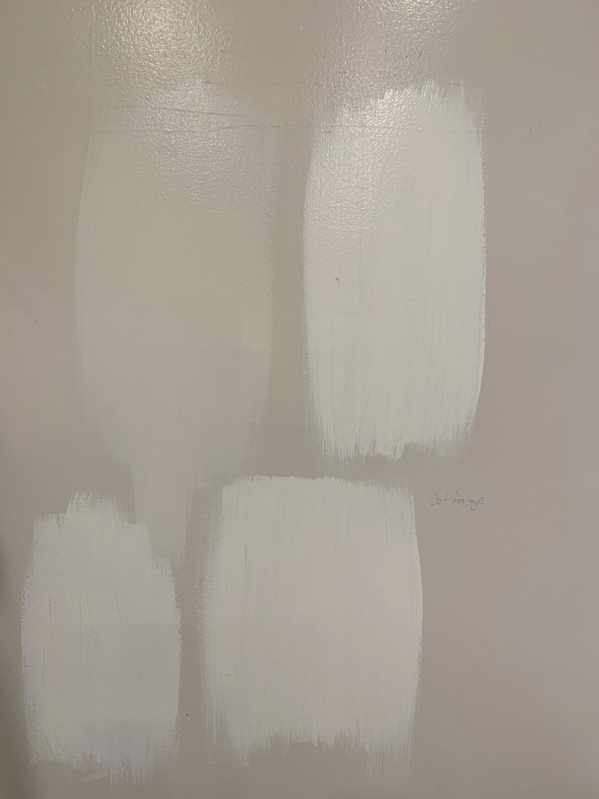
It was important to us that the kitchen be bright and airy. Since we only have one window in the kitchen, we we felt that an almost all white kitchen would really reflect light. We chose to have custom cabinets that touch the ceilings in order to maximize space and draw your eye up. For cabinet paint we used “ Swiss Coffee” , and the walls are painted a soft white/yellow. The ceiling and trim are a bright glossy white.
We replaced the white fridge with a floor to celling pantry with pull out drawers and outlets. The fridge replaced the previous stove location.
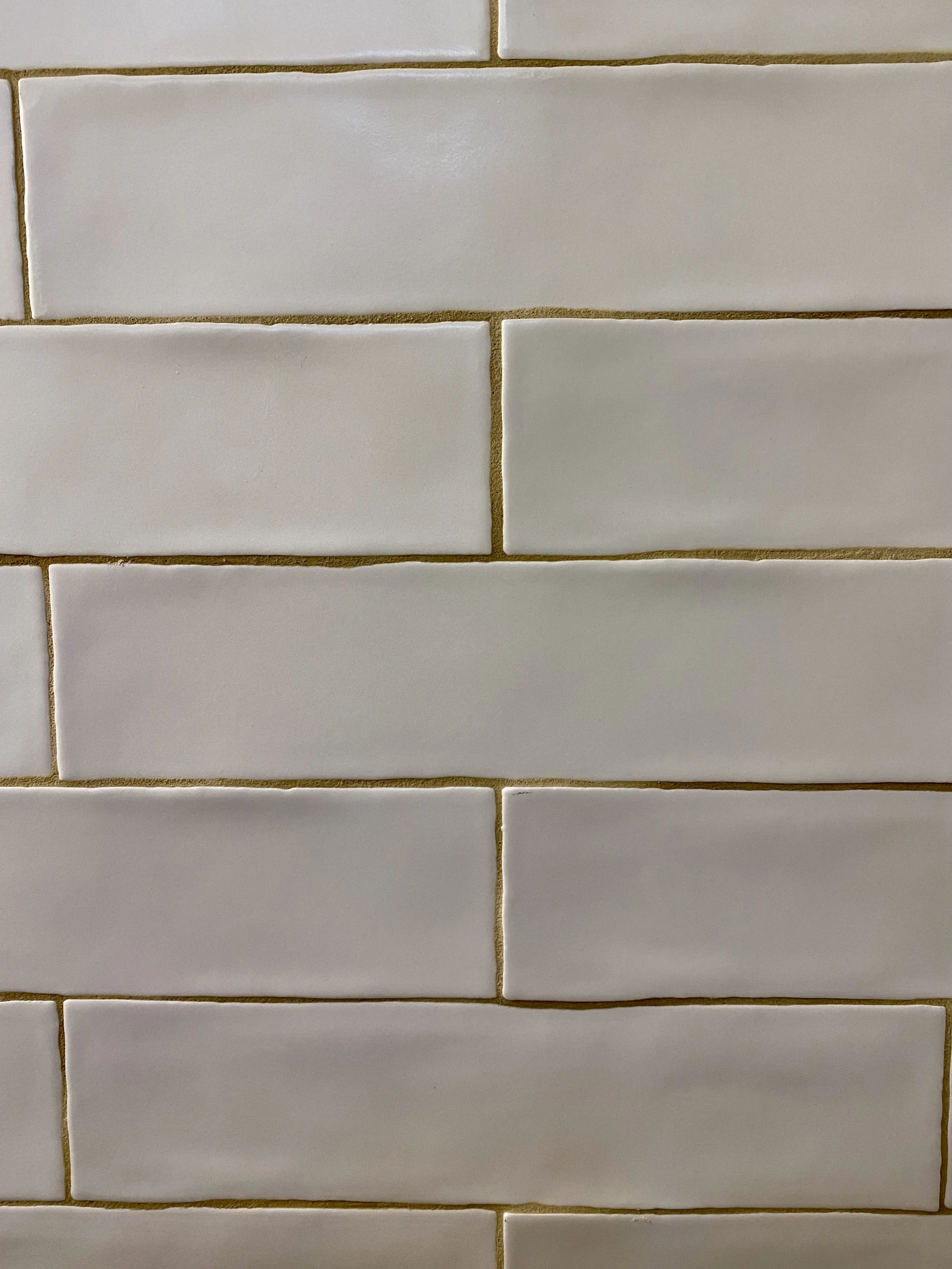
For the counter we went with a bright white quartz with light grey/blue veining. We tied this in with our Santa Barbara inspired tiled backsplash. The grey/blue is actually a play off the blue we have on our coffered ceilings and the exterior of the home.
““Have nothing in your house that you do not know to be useful, or believe to be beautiful””
Oh the changes that happened…
When selecting a fridge for a small house, a good trick is to look for a counter depth fridge that sits in line with the counter. Double doors allow you to access the fridge in tight spaces, and keeps things at eye level.
Pippas favorite spot is in the hallway watching the stove.


